Sunday, September 25, 2011

SOVA block test 2


Growth by Han Sai Por, 1985

a) Describe the subject matter of both works.

For Looking Ahead by Ng Eng Teng, it depicts truncated parts of body. The form is simplified and abstract, but the general shape of the hands and the facial expression could still be identified. The sculpture shows knee and part of thigh act as the base supporting the whole sculpture. The two forearms with hands could be easily identified. The absence of arm and body brings viewers’ attention to the forearm, the hands, and the head which is hold within the hand. The sculpture suggests a optimistic outlook as suggested in the artwork’s name. The expression on the face shows a rather relax and comfortable mood. The sculpture is supported by one forearm thus makes the sculpture looks rather unstable. This might due to the fact that the artist wants to convey that even though life might be hard but we must still look forward to the bright future ahead.

For Growth by Han Sai Por, it consists of 5 unique sculptures, each have different shapes. All these sculpture have smooth curve line, organic and naturalistic shapes. Also the texture is very smooth and the lines bring a sense of fluidity to the sculptures. Each of the five sculptures has different protrusions pointed at different angle. They seem to be struggling to survive and grow. There is like an unseen internal force exert on the sculptures. These five sculptures seem represent different stages of growing. As the forms are abstract and organic, it is hard to identify what the objects actually representing. However, it looks like different stages of plant growing from seed to young plant. As first stage, the first sculptures at the bottom left hand corner, the protrusion is bended at a low angle and the body seems like curl together. These might suggest that the seeds have felt the external force exert on it in the soil, which restrict its growing. However, as time passes, the seed start to grow and struggle to break free from the difficulties and unpleasant environment. This is depicted by the one of the sculptures at the left side and two at the right side of the series. Here, the protrusion are more and more round in shape and it is pointing more and more towards a higher angle which symbolize that the plant are growing taller and stronger. Finally, as depicted in the last sculpture at the top, the sculpture is standing up right with smooth curve and rounded angle. This shows that the seed has become a young adult plant which has been through growing period from a “baby” to an “adult”.

b) Discuss similarities and differences that exist in their treatment of forms and use of materials.

For Looking Ahead by Ng Eng Teng, the form is reduced to its simplest form. Different part of the body is been examined individually and reorganized to put it into composition. Most of the body part is been reduced to its basic shape or been removed from the composition – such as the torso, the arm and the legs. However, the elements of the sculpture still can be easily identified as the essences of the elements are still kept, such as the hands and the expression of the face.

However, for Growth by Han Sai Por, the forms are been abstracted and highly reduced to its basic organic shapes. The objects depicted by the sculptures could not be told by the viewers. The five sculptures exist individually yet they coincide with each other due to resemblance in their forms.

Both the artworks depict the form using smooth curve, which gives the artworks a sense of fluidity. Also, both of the artworks appear to be more of less rounded as the forms are reduced to simplest form.

For the use of material, Looking Ahead is made of bronze. It thus gives the artwork a more textured surface and metallic feeling. The texture of bronze could still be seen and touched in the sculpture. This might further suggest that even the life might be hard, which show by the texture of the bronze left from sculpture, we still must look ahead to the future.

In terms of the material complement to the message the artist wants to convey, Han Sai Por did the same thing as well. Instead of using bronze, she uses marble. Han Sai Por uses marble to carve out smooth textured surface and fluid line. This might suggest to the tenderness of a baby, or a young plant.

c) In your opinion, which work would you choose to be displayed in Nanyang Girls' High Schoo as part of our permanent art collection and where will the chosen work be exhibited? Discuss with consideration given to the artist's background, repertoire of works, approaches to art etc.

In my opinion, Growth by Han Sai Por should be displayed in school. This is because that Han Sai Por concerns about the balance between nature and urban life. Through her artwork, she wishes to advocate people to stay away from war and conflict, and find back the purity and emotion we used to have when we lived as part of nature. To her, due to the high-technology we have today, we have forgotten about the importance of nature, the environment. She hopes that through her artwork, people will stop and ponder the correct way to live with. This value is what we need to teach the student in school as well. The students need to know the importance of environment and not to be over-relying on the technology. This habit should be instilled since young so that the students will learn to appreciate the beauty of nature and not be controlled by the hurry life in urban city.

Also, the sculpture depicts the different growing stages. As secondary student, they are at their most crucial stage of growth. They will start to face a lot of challenges and start to struggle with the life and school’s workload. Thus, with Growth displayed in school, the students will learn how to struggle with inner forces, inner belief and problems in life during their growing stages. Also, as the students most likely to have puberty at this stage, they will face a lot of physical, psychological and emotional changes, just like the different shape in the sculpture. Therefore, the Growth can represent the students and make the student more relate to the artwork.

However, Ng Eng Teng’s sculpture may seem to be more disturbing to the students and the students may feel uneasy about it. As Ng Eng Teng’s main theme is human condition, he experiment on moving around different body parts, recombination and make the sculpture appear in an unusual way. However, even though in Looking Ahead the sculpture contains a positive meaning, but the distortion in form make the sculpture less appealing to the students. Also, the subject matter might be too difficult for the students to understand as they are not mature enough yet.
SOVA block test 1

Spying Eyes by Lucia Hartini, 1989

a) Discuss the use of colour and brushwork.

In the painting, Spying Eyes, Lucia Hartini had used strong contrasting colour of orange red and shades of bright blue. The brick wall, which extend from the foreground all the way to the background, is getting smaller and smaller creating a sense of depth. It is painted with orange-red and occupied almost three-quarter of the painting. In contrast, the drapery that is worn by the female figure at the foreground of the painting is painted with different shades of blue. The orange-red, which is the main background colour, creates a strong contrast with the blue drapery thus allow the viewer’s eyes to focus on the female figures, which brings out the importance of the female figure despite the fact that it has only occupied a relative small proportion of the painting.

Moreover, the background of the painting is painted with turbulent sky with thick layers of clouds. The general dark tone of the background also set contrast with the foreground where the colours used are much brighter. Thus, the bright colours with highlights in the foreground caught viewers’ attention first. The viewers will then notice the significance of the female figure and the cracking zigzag brick walls. The female figure is painted in golden brown, which represent a healthy skin tone. The colour might have easily blended in with the brick wall with the absence of the blue drapery. However, the blue drapery that wrapped around the female figures provides contrast with the skin tone thus highlights its importance instead. Hence the viewers’ eyes will travel from the female figure along the brick wall towards the background of the painting.

As for the brushwork, the artist has adopted a high academic accuracy and traditional painting technique. Every brushstroke are well-blended, no trace of brushstrokes could be seen. In this manner, the form of the figure will be well rendered and clearly defined. Thus, it will provide a realistic form that is highly resemblance to real life. This corroborate with artist’s intention of painting in surrealistic style, where the objects that are taken from real life are combine in an illogical way to form a dream-like world. The realistic figure yet in a fantasy setting will thus bewilder the viewers.

Secondly, the brushwork for the blue drapery has highlighted the contrast between the shadows and the smooth curve of the fabric. Thus it gives the drapery a sense of fluidity and realistic form. However, as for the brick wall, the hard edges are clearly defined. This provides a contrast between the drapery and the wall which can shock the viewers.

b) What social concerns are intended in Lucia Hartini’s work? Discuss with reference to “Spying Eyes” and another named work by Lucia Hartini.

Lucia Hartini’s works are intended to engage critically the inherited gender norms and social expectation of women in Indonesia. This could be seen both in “Spying Eyes” and “Srikandi” 1993.

Lucia Hartini’s art is inseparable from the social-political condition in Indonesia. Here, the women are perceive as subordinate to men and is seen to be obedient to man’s order. Women are been looked down and especially so for female artists. Due to the society, there are very few female artists and usually their voice could not be heard. The social and political judgments also constantly criticize them. Lucia Hartini once said, “my obsession with eyes, especially human (spying) eyes, frightened me very much. They follow me wherever I go and watch my business.” Thus, human eyes have appeared in both of her artwork “Spying Eyes” and “Srikandi”. In “Spying Eyes”, the female figure is drawn cradle together which suggest lack of security due to the eyes from the public keeps on scrutinizing her. While in “Srikandi”, the female figure stared back at the glaze confidently. This shows that the public often criticize the female artist due to the existing gender norm.

Also, it is also shown in the brick wall found in both paintings. In “Spying Eyes”, the zigzagged wall may represent the social prejudice that trapped the female figure. This wall seems extended all the way to the sky signified that the social norms had existed for a very long time. The brick wall is also painted in orange-red which may represent Hartini’s angers and frustration towards such system. The brick wall is in zigzag may also indicate the difficulties the female in Indonesia had to go through while trying to fight back against the system. While in “Srikandi”, though one side of the brick wall is in zigzag form. The other side is straightened. It might represent her will of fighting back the rigid social prejudice. In addition, both paintings shoe that there are cracks on the wall and the smooth drapery are covering the wall, this might represent that this sexism are slowly eroding in modern days.

c) Lucia Hartini has explored dreams and imagination as she sought to discover herself through her works. Why did she create dream-like imagery and do you think she has been effective in using dreams as part of her work? Discuss with reference to her named works.

Lucia Hartini lived in a society where straight forward critical and confession discourse are not accepted. Thus she is forced to adopt allegorical and symbolic style to express her thoughts and ideas. As she had been engage critically with inherited gender norms and social expectation, she addresses the issues in an open, honest and advocating ways with the use of dream-like imagery. I think she had been effective in using dreams as art of her work, due to her use of symbolical figures in the painting such as in “Srikandi”, 1993.

In “Srikandi”, Lucia Hartini painted a female figure, which represents srikandi, a well-know “women warrior” in the legend of Indonesia. Srikandi fight courageously in the battle and won the recognition of Prince Arjunza. It is dressed in the blue clothes which were worn by the members of women armies who fought to protect the Sultan. Srikandi, the female figure, stand confidently and looks back at the doubting gazes from the public. Due to this famous and well-known heroic female figure, Lucia Hartini can thus effectively convey her message to the viewers, which is to fight back the doubting and scrutinizing eyes of the society and break the social gender norms. Though due to the social-political condition, she was unable to paint openly on the canvas of her hidden message, her used of dream-like imagery did provoke a sense of confusion at the viewers and shock them.

Furthermore, the use of vibrant yet contrasting colour, the zigzagged cracking walls and the turbulent sky did mention to the viewers her hidden message. The orange-red suggest her anger at such social issue of sexism. The fantasy setting yet realistic figure advocate the viewers. It bewilders the viewers with such contrasting elements and thus makes them think of the environment around them. Though dream-like imagery is not realistic, but it is highly resemblance to the real life and it is easier to engage powerful emotion and allow the viewers to understand the art piece clearly. Such as the cracking brick wall did suggest Hartini’s desire to break through the cage of gender prejudice.

ceremics - nature

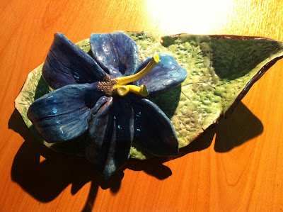
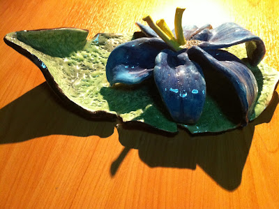
This is the ceramic i did last time. The theme is nature. As compared to other people, i have adopt a more realistic approach. I want to show the fragility of the flower. I have tried to make different textures for the leaves and the flower to show a contrast and bring out the softness of the flower. The leaf is placed beneath the flower to suggest that the leaf is used to protect the flower as flower is very fragile.


pinhole photograph

These are the pinhole photography i did two years ago:)

While waiting outside the science laboratory, we can always enjoy looking at the fishes and feel the cooling breeze. It might be on e thing that we always took for granted. So I hope this photo could make you cherish every little thing in our school. The tree in the middle had divided the two blocks into two sections, contrasting each other. I had also used on third rule. There was something I could do to improve on this piece of work. First, I should take more photos so that I could take a better photo. Secondly, I need to have more planning before I took the photos, so that the photos could look more interesting. By doing this work, I have learnt to be patient and never give up. Sometimes the results might just not turn out to be what we expected. Just remember, keep trying.

the followings are some photos which i found interesting too.


last year eoy painting

This is my last year EOY drawing. the theme is play. i have use acrylic for this painting. i want to convey a sense of celebration and fun. i have use many subjects inspired from funfair, such as the ice-cream and cake. the girl on the hot-air balloon is laughing and cheering. the pig-head hot-air balloon also helps to create a sense of humor and mischievous to the painting. actually i feel that this painting is more like a funfair poster. also, i think that it whole painting is quite plain as all the figures are place quite further apart.

drawing of mushroom

This is the mushroom i draw 3 years back. It is quite difficult for me to draw it at that time as i must really observed the textures and small details closely. also, i must also take note of the change in tone as well. i think i should have make the line finer and neater, as some parts of the drawing looks quite messy and roughly drawn.

p.s. the mushroom soup is very nice:)

Wednesday, September 21, 2011

the end...

In my coursework, suggest the girl is sitting on the debris which cause by the earthquake. The waves in front represent the natural forces which could easily destroy people’s property and cause loss of human lives. The girl is been trapped by the chains, which caused the girl to remain in sorrow and sadness. As the girl’s facial features could not be seen, it says that the girl is very lost. The butterfly wings behind her symbolizes her will of breaking free from the chains, but the broken wing (due to the suffering) does not allow her to do so. As she is alone in the drawing, and she is hugging herself, it shows that she is lonely and lack of security. The little green plants hiding near her in the debris suggest that hope is actually around her, but she must first have the courage to look up in order to discover the hope.

The top part of the drawing depicts the heavenly-like place. This represents a place where many people, who lived in the suffering, would like to go to. The butterfly, which symbolizes the hope, suggests that the hope could change the life of the girl.